Food Tricks That Make You Think Food Is Healthier Than It Is
Lite Rock 96.9
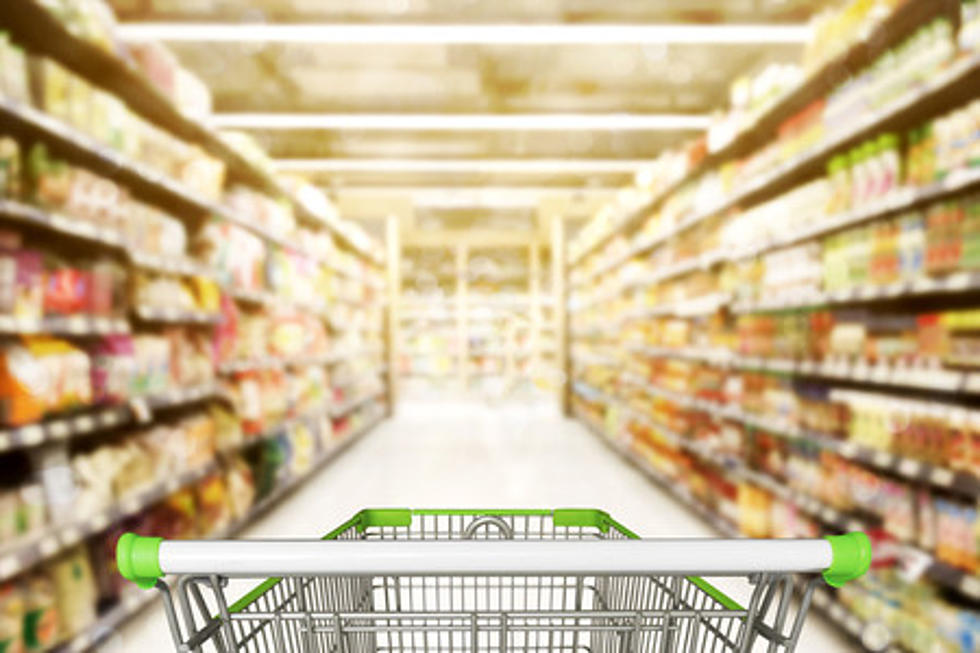
We have all heard the saying, knowledge is power. That is why it is important to know what you are really buying at the food market before adding it to your shopping cart. Let’s face it, the grocery store is full of temptation. Bright colors, cool packaging, and creative displays can all be very enticing yet overwhelming when making your trip to the store. It is not by accident. Manufacturers often want to present products as healthier and better than they really are.
However, looks can be deceiving. Be aware of words such as wholesome, healthy, or natural which are generally not regulated. Also, pictures of streams or a garden can create the illusion that the food is farm fresh or earthy. Before tossing something in your cart, read the nutrition label carefully and decide for yourself. Here are some tactics manufacturers use to trick us into thinking their product is better for us
Here are some tricks and tips to avoid being duped by a “healthy” product.
- 1
Thin, shapely containers
A lot of low calories drinks tend to always be packaged in thin bottles, like skinny margaritas and sparkling waters. The silhouette alone promotes that the product is slimming. People perceive food and drinks in elongated packages as fewer calories than those in wide products.
- 2
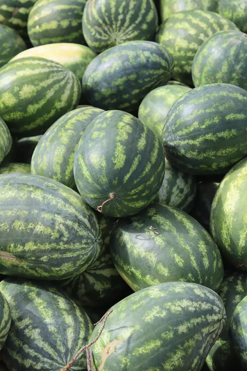
Images of fields, farms, grains and produce
The images printed on these packages want you to associate with the food than the quality of the food itself. These pictures also leave an unconscious cue, connoting unprocessed, farm-fresh, natural foods that are full of healthful properties.
- 3
Muted Colors
When these manufacturers want to give you the impression that their food is more healthful and natural they tend to steer clear of bold colors on the packaging in favor of more muted tones. People associate paler hues with a “better for you” product. Whereas with brighter colors they see more artificial boosted flavors.
- 4
Brown paper packaging:
The packing material considered to be more eco-friendly, such as glass or brown paper, or cardboard can lead us to believe the food inside is better too. More environmentally friendly customers are often willing to pay more for these attributes.
- 5
Transparency
Another popular design packaging is transparent material for all or part of the food package. A small window into what’s inside a food container not only provides you an insight into what you are choosing but also provides a first impression of the food inside. These packages are perceived to be higher quality, more attractive, and healthier than those in opaque packages.
More From Beach Radio